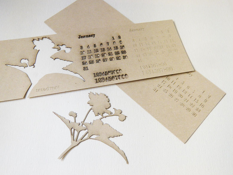
Tinted Mint Laser Cut Calendar - 1st Prototype
Making 2011 calendar sets for my Tinted Mint shop. Here's an experiment with a combination of laser cutting and engraving/etching on 0.6mm thick card board.
I find it is best to put together sample artwork that will test different size fonts, line weights, etc. and experiment with laser settings for the material I'll be using. Seeing these results really help in how I should refine artwork for the final run.

Laser Cutting at TechShop

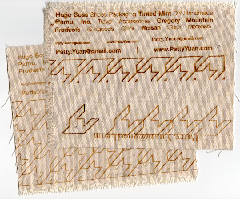
Took a 2 hour Laser Cutting and Etching SBU class at Techshop yesterday morning. The class was very interactive and hands-on, covering fire and safety precautions and how to set up and use their laser cutting machine, specifically their Epilog 60 watt, 1 of 3 machines.
I am making a custom case/sleeve out of organic cotton canvas to put a portfolio sample in as self-promotion. Here are several tests on 2 pieces of canvas. The class gives you the basic knowledge, but ultimately each machine and material requires some testing of the correct parameters for the laser, affecting quality and how much material is burned off. I use back and front of the canvas and sometimes have different settings for top and bottom halves. This is not what the final artwork is supposed to look like. But I test different size fonts and line weights and can adjust my artwork from these results. Note the darker brown is due to more heat from the laser and on some areas it was enough heat to burn/cut all the way through the canvas.
German Stamps, Graphic Minimalism Makes Statement
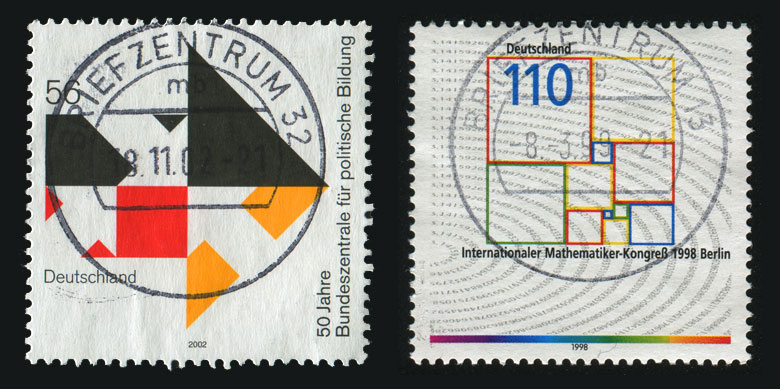
Found these 2 stamps through Shutterstock. One is from 2002 while the other 1998, but they both share the same design language. The simplicity of the graphics is what makes it so strong, reminiscent of Bauhaus minimalism. Even today, the design remains contemporary.
Below Left: GERMANY- CIRCA 2002: stamp printed by Germany, shows emblem Federal Agency for Civic Education
Below Right: GERMANY - CIRCA 1998: stamp printed by Germany, shows square, Congress of Mathematicians, Berlin

Catherine Hammerton's Bespoke Wallpaper
I saw Catherine's work at 2009 ICFF in the British Designers area. Her beautiful bespoke wallpapers captured my attention with its vintage feel and delicate palette. I especially adore her Bramble wallpaper, a three-dimensional effect created by layering die-cut floral shapes.
Verve Coffee Roasters
 Chen Design Associates for Verve Coffee Roasters. The combination of damask and other graphic repeats give the packaging a luxurious look, while the lime and orange against espresso keep it modern.
Tokyo Milk Soap no. 82
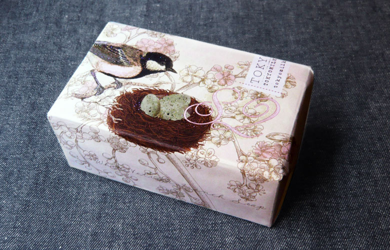
This is the first Tokyo Milk product I've purchased, but I've been aware of the brand for a while and absolutely adore their packaging! Very delicate and girly. I like deconstructing packaging to better understand how it's put together and for my own design reference. I was confused when I saw it at Anthropologie because I couldn't figure out what scent this was. Now after going to their website, I realize the same scent comes in 3 different graphic covers, all labeled with the same info. This particular one is Soap no. 82, bird.
I used to prefer liquid soaps, but I've come to appreciate bar soaps because it uses minimal packaging, less waste to throw away. Plus, the paper packaging is decorated with beautiful graphics that can be reused in other packaging or craft project. Ever since I came across this video on YouTube about the island/whirlpool of plastics in the middle of the Pacific, I've become much more careful about buying products encased in plastic.

